99 Atlantic
Signage Wayfinding
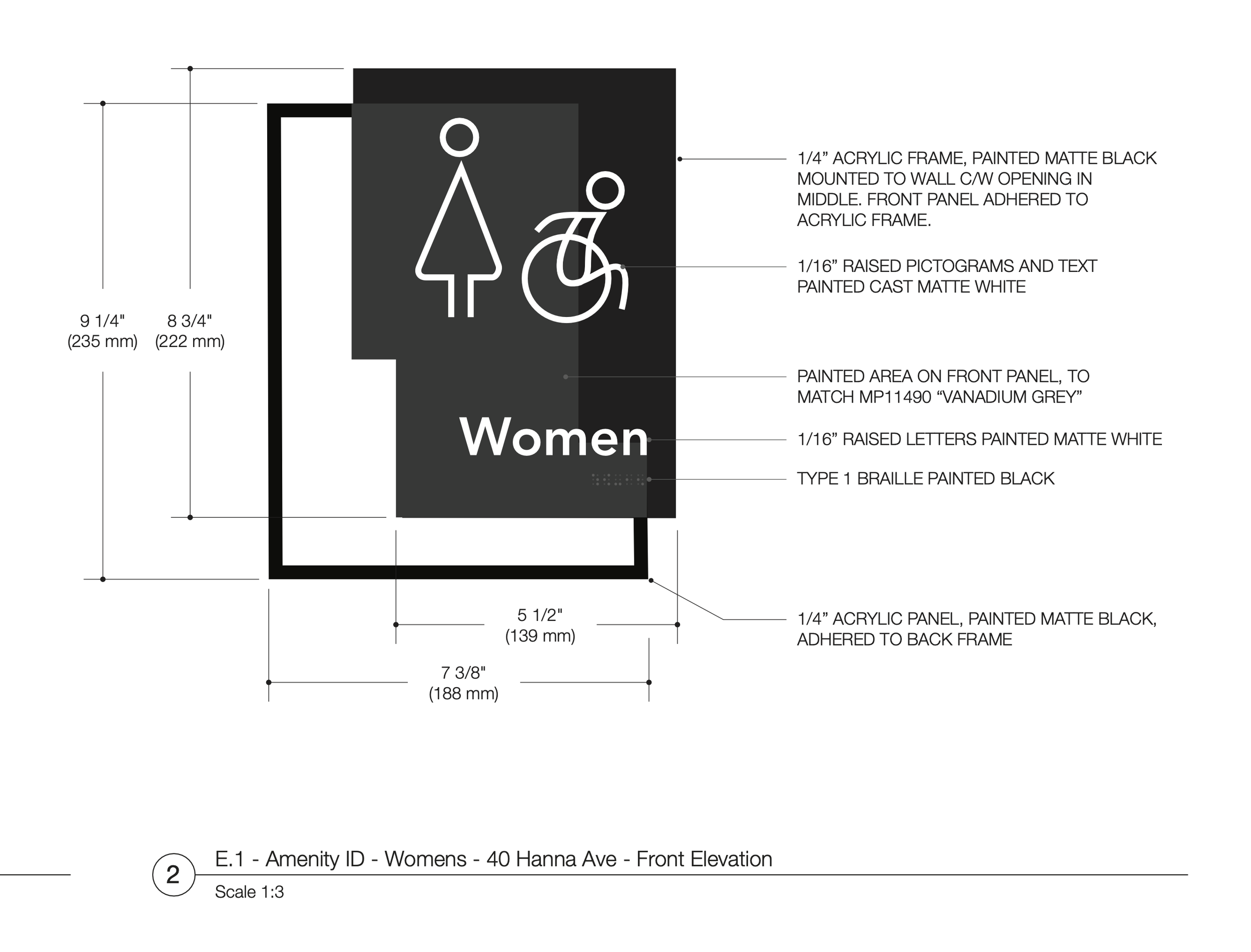
In this wayfinding project, I've taken inspiration from the interesting shapes created by two overlapping buildings. These shapes have become the main feature of the signage program. It's like using the buildings' footprints as a map, guiding people through the area. Each sign is designed to be clear and easy to follow, reflecting how the buildings come together. The idea is to make navigating the space straightforward and engaging, using the unique layout of the buildings as a guide. This approach turns the simple act of finding your way into a more intuitive and visually interesting experience.
The system adjusts based on your location, using a dark-filled panel to indicate which building you are currently in. The simple elements and shapes make navigation more intuitive and engaging.
Reference images, inspired by the variety of colour and the simple overlapping geometric shapes and typography.


